


This post was sponsored by Keep, my favorite new site for all things shopping and inspiration. Thank you for supporting the sponsors that so generously help keep The Sweetest Occasion rockin’!
Things have been moving right along here in our adventures in unpacking, decorating and organizing our new place. I know I haven’t shared any updates in a while, but that’s largely because we’re at the part in the process where things slow down as we finalize decisions regarding what paint colors to use to gussy up old furniture and enact little DIY touches that will really make the place a home. No worries, I’ve been taking tons of photos and as we complete projects along the way there will be loads of posts coming your way! In the meantime, I wanted to talk about the color palette and give you a few tips on how you can create a cohesive color palette in your own home. Particularly if you’re working with a small space or a rental, take note! You don’t need to be a card carrying interior designer to create a palette you’ll love and that has fabulous flow from room to room.

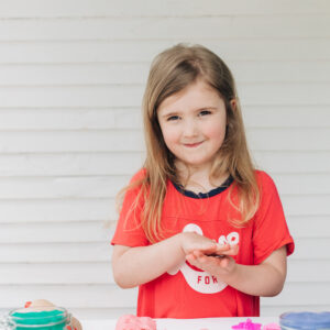
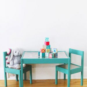
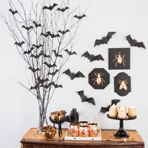
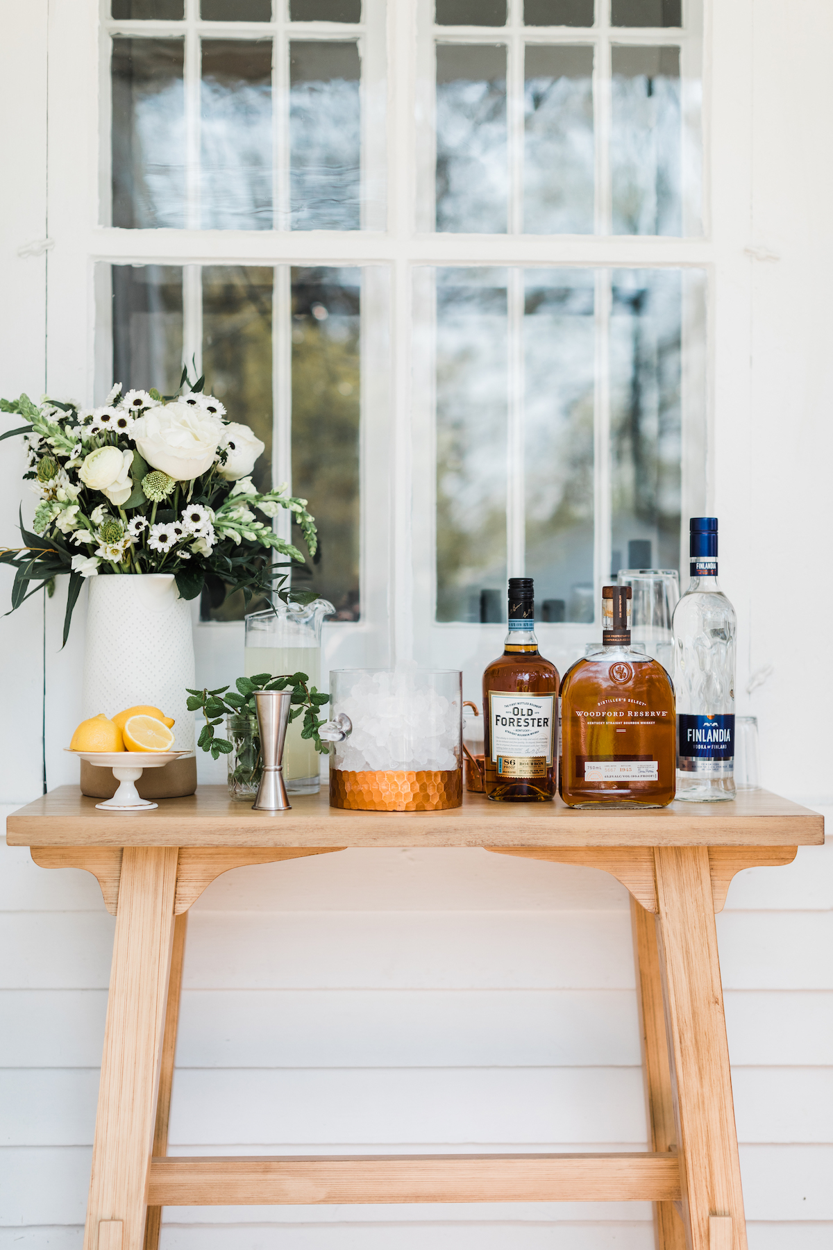
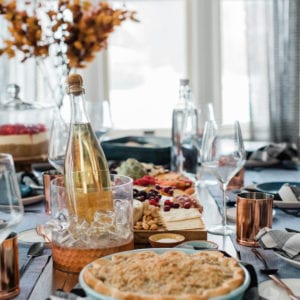
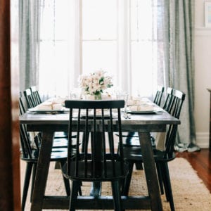
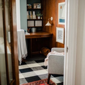
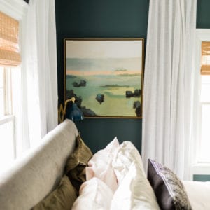
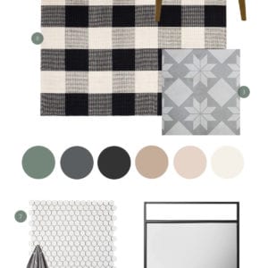
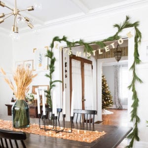
My best piece of advice when choosing a color palette for a smaller home? Pick one fabulous neutral and paint all the walls the same color. Our walls were already painted Parisian Taupe by Behr so we stuck with that color, but other favorites are Stonington Gray and Edgecomb Gray, both by Benjamin Moore. Going with one wall color makes all the rooms flow, instead of creating visual choppiness as you move from room to room. It’s a simple trick but it really works! Next, choose one main accent color that appears somewhere in each room. In our case it’s a rich deep navy. Our rug in the living room, the bedding in the boys’ bedroom, a striped shower curtain in the bathroom, a pair of bold glass lamps in the master bedroom. Make sure this color is one that you love and use a little or a lot in each room. Then in each room, layer on the other pops of color! Throughout our home those colors will appear in the form of coral, mint, bits of turquoise and even a deep orange hue. Just choose colors that look fabulous together, that complement your paint color and your main accent color and you really can’t go wrong. Stay tuned – so many more updates and tips to come as we continue our nesting adventures!
p.s. There’s just two days left to enter our amazing giveaway with Keep.com where you can win $250 toward making your own home a little sweeter. Oh, and one runner up is going to win a prize valued up to $100, too. So run (don’t walk) and be sure to enter!
![]()
[Shop: Paint color | striped bedding | rug | coral and navy pillow | gold lacquer tray | lamp | turquoise pillow | pear art print | gold leaf tray | mountain art print | striped shower curtain.]
This post was sponsored by Keep. Read more about our editorial policies.


 Back to Top